Flexible Search: Unlocking Unused Supply to Drive Conversion
A project to illustrate product-led growth can work.
Proving that reducing constraints increases conversion by 3x. An experimentation project exploring how to align marketplace supply with the two core user behaviours: Structured Planning vs. Flexible Discovery.
June 2025
-
Context & Project type
The Context: Goboony is a P2P marketplace where inventory is unique (one van, one owner). We match traveller needs with owner listings (campervans).
The Problem: High traffic, low conversion. During the recent quarter we observed a slight drop in conversion for travellers visiting our search page, to requesting to book a motorhome.
Our industry related research and qualitative observations led us to believe we dont have one core search behaviour that contributes to successful conversion.
This design driven initiative needed experimentation to give a data-informed case study to our business. The execution was a A/B test. -
Objective & Hypothesis
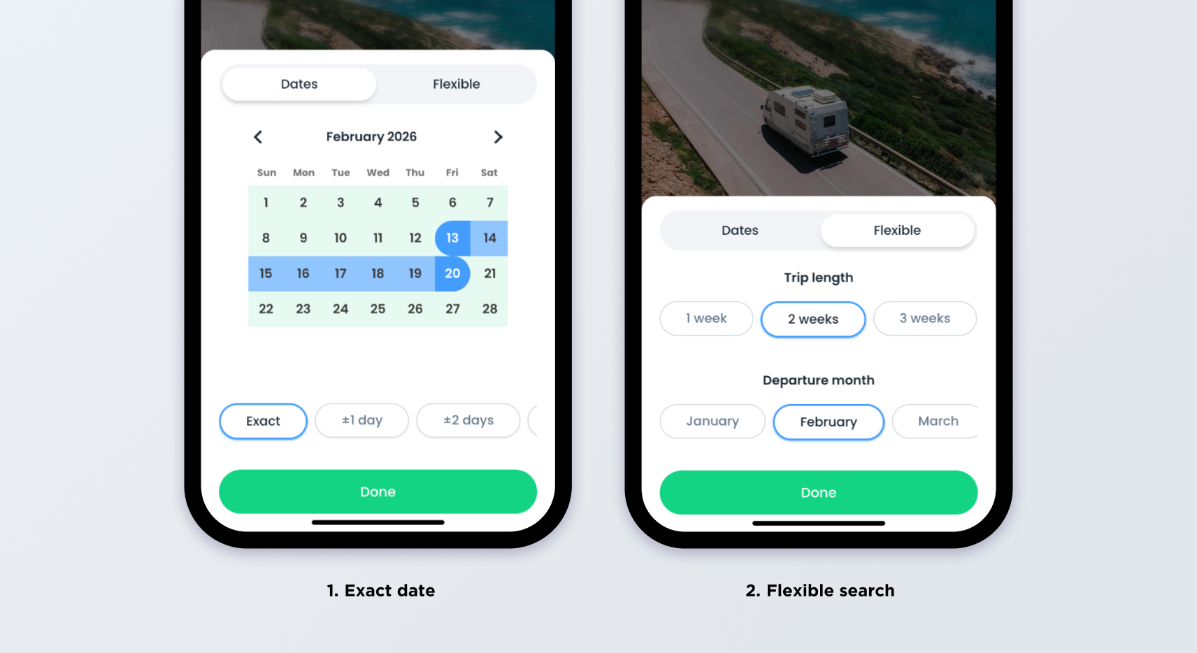
Objective: The goal of this experiment is to see if the Flexible Search Feature helps more users send booking requests, which can lead to more bookings. By offering options like flexible dates, we aim to make it easier for users to find available listings and plan their trips. The execusion was an Experiment (A/B Test)
Hypothesis: Providing flexible date options and the ability to adjust exact dates with extra days will make it easier for users with uncertain travel plans or travel dates to explore available listings. By simplifying the process of browsing and selecting travel dates, more users will engage with the search feature, resulting in a higher number of booking requests. -
My role and responsibilities
Unlike a traditional design process, I initiated this project as a Growth projectrather than just a UI feature.
The "Growth Trio": I partnered with our Growth Hackers to define the A/B test, to design and build the feature together.
Designing for growth requires restraint. While I had a comprehensive long-term roadmap for Search, I advocated for a variable-isolated approach in the A/B test. Along with the growth hacker we stripped the experimental UI down to a single interaction change, ensuring that any shift in metrics could be scientifically attributed to the 'Flexibility' feature itself.
The High-Stakes Environment
The Search page is the highest-volume entry point on the marketplace platform. As the primary driver of GMV, it is a high-sensitivity environment where even minor friction can have significant financial consequences. We needed to innovate without destabilizing the core revenue stream of the business and prove to leadership to trust product-led growth
Design and experimentation approach
Design framework
With search at the core of our marketplace value proposition, it’s both a risk and a opportunity to make changes on this part of the journey. Ultimately, we want to be able to improve the user experience constantly especially as the industry and business evolves.
Understand how to measure ROI of design
When we deliver only improvements that are visual, it can be hard to correlate value, even when measuring baseline metric.
Coupling visual improvements with a feature or change that can be connected to a clear metric drives motivation for the project in business, as well as makes it easy to measure the success and real ROI of design.
Experiment: A controlled A/B tet
To ensure data integrity, I collaborated with the Growth Squad to design a controlled A/B test rather than a feature rollout. We needed to isolate the "Flexibility" variable to measure its direct impact : Request Sent event
1. The Mechanics 50/50 Split: We split traffic 50/50 upon page load and set a control and variant group along with an exposure event to tag users downstream.
2. Tracking Plan: We needed to understand intent, not just usage. We instrumented three layers of data capture:
Intent Segmentation: We added parameters to the Search Result event to bucket users based on intent.
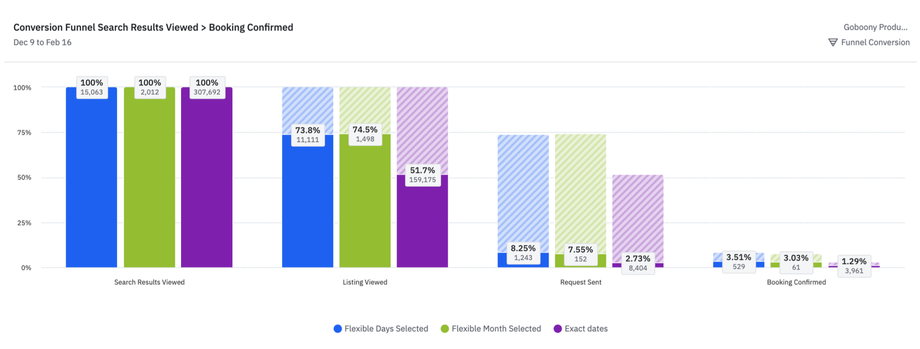
Funnel Impact: We carried these tags through the funnel. This crucial step allowed us to correlate the type of search performed with the final conversion rate, proving that flexible searchers were 3x more likely to convert.
3. Success Metrics
Primary Metric: Conversion to Request Sent.
Secondary Metric: Search Result Viewed (Did they find inventory?).
Guardrail Metric: Booking Confirmed (Ensuring quality didn't drop).
Conversion Funnel: Viewed -> Booking Confirmed
Most interesting takeaways
Most interesting takeaways
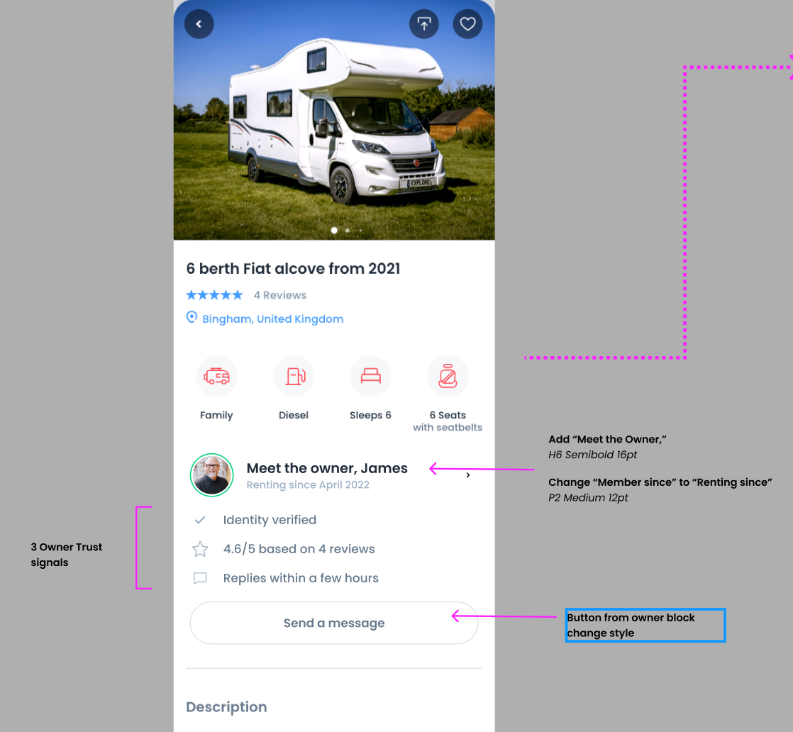
Elevating Identity Signals: In the absence of product reviews, Identity becomes the proxy for trust. We redesigned the rigorous detail page to prioritise the Counterparty Profile. By highlighting response rates and "Verified" badges above the fold, we humanised the counterparty, effectively performing a "Soft KYC" (Know Your Customer) check for the user.
.
Risk insurance
Simplifying Risk Mitigation (Insurance): Legal/Insurance jargon causes cognitive friction. We rewrote complex policy terms into plain English "Benefit Statements." This wasn't just copywriting; it was UX Writing for Compliance, ensuring users understood their safety net without being overwhelmed by fine print.
Verification as a Feature
Visualising "Proof of Asset": We utilised backend vehicle databases to verify the campervan’s existence and insurance status. We surfaced these checks as "Verified Asset" badges on the UI.
Users don't need to see the raw database they just need the UI to confirm the asset is real/verified.
Manage expectations with clear process steps
Our booking journey is not the most straight forward due to it being a marketplace, and our strict and safe process to book. For first timers, it can be confusing to know what happens once I initiate to book. Creating an easy visible and visual representation of our booking flow can help users feel confident to start the process
Conclusion
It’s clear that people trust people, not businesses. After analysing the results of our various A/B tests, it became obvious that the solutions focused around increasing ‘humanness’ had the biggest impact on trust, and reducing the time from page view to booking initiated.
Here are some key things we did to illustrate human traits to our journey
Moved the owner block higher on the page with their clear profile picture, and highlighted our feature to message the owner before you book. Encouraging them to interact with the real person who owns this camper van. Because it’s way easier to trust a mom or a dad with a family life like your own.
We moved reviews from other travellers higher up on the page. Reading from other peoples experiences helps build trust.
For insurance products, we evaluated the information and rewrote the information in more casual everyday language. We also focused on writing it from the lens of ‘Why would I as a traveller want this insurance’. This directly spoke to fears of our users
My learnings:
This project was a great testament to how design, data and development can work in parallel when creating new solutions.
Having data team involved from the beginning helped us keep in mind what and how we want to measure ‘success’ for each solution. This greatly helped us advocate for the solutions to the business, as well as confidently see the impact of design